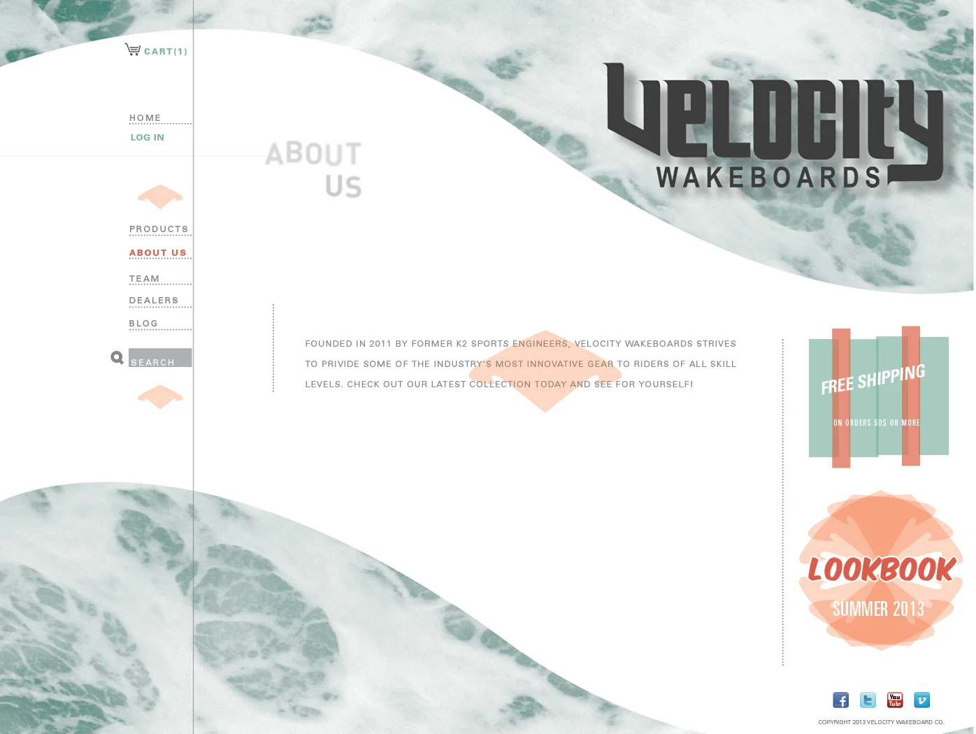
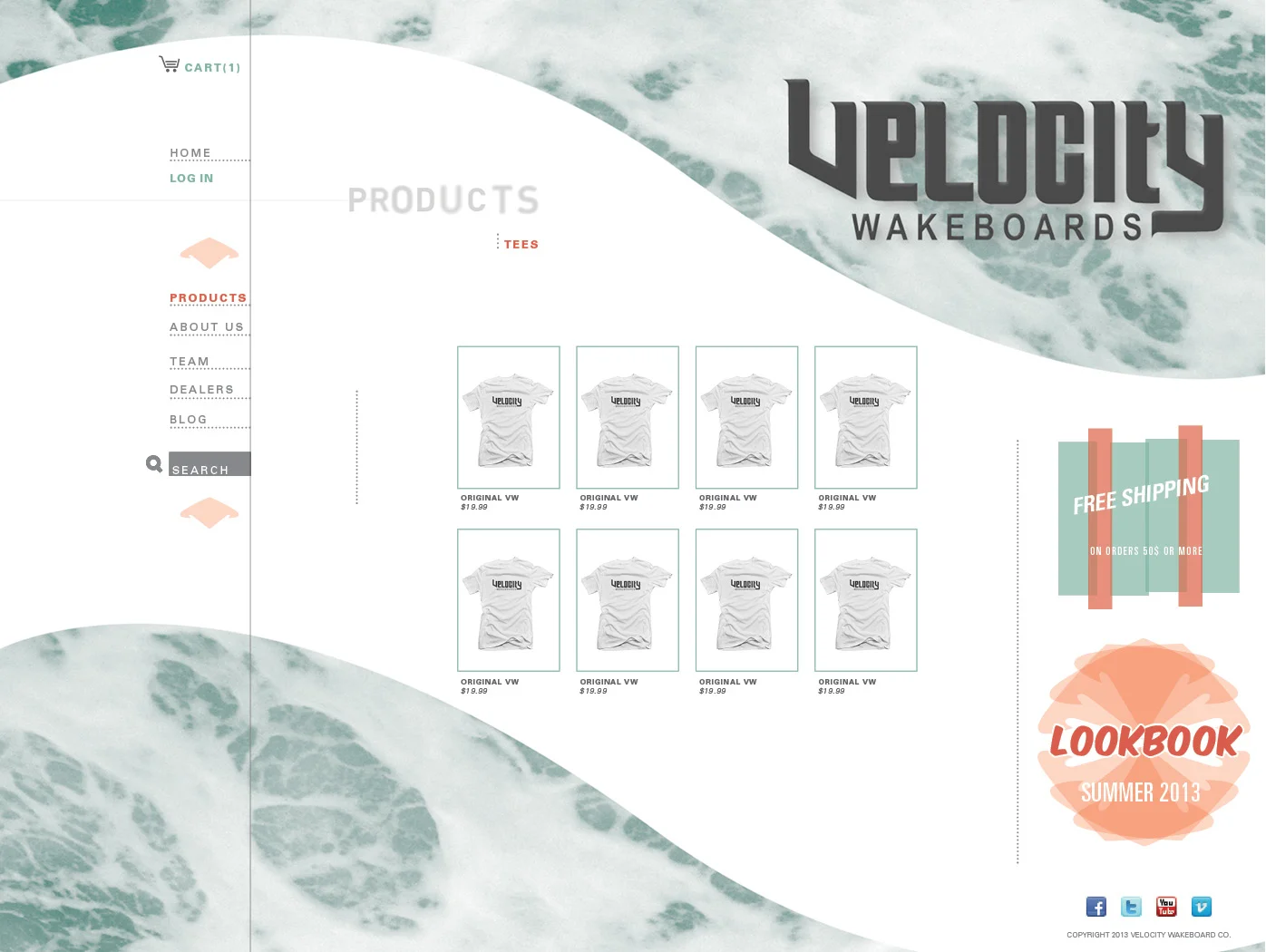
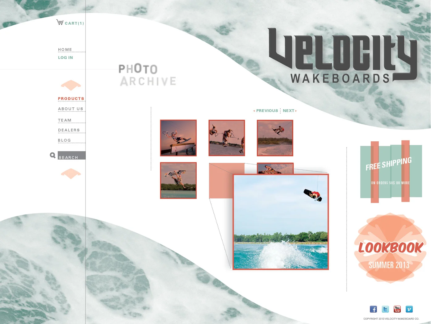
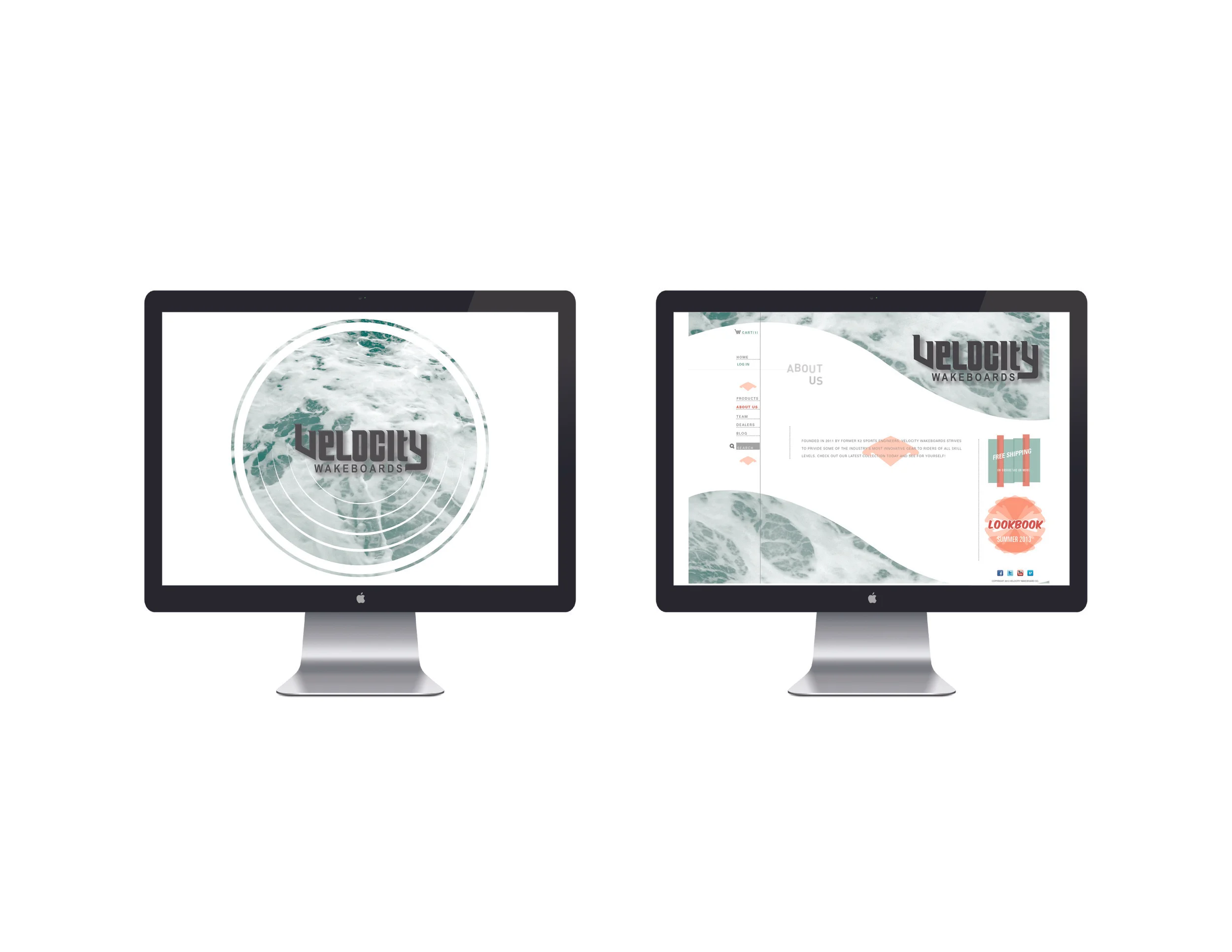
Identity / Website Design
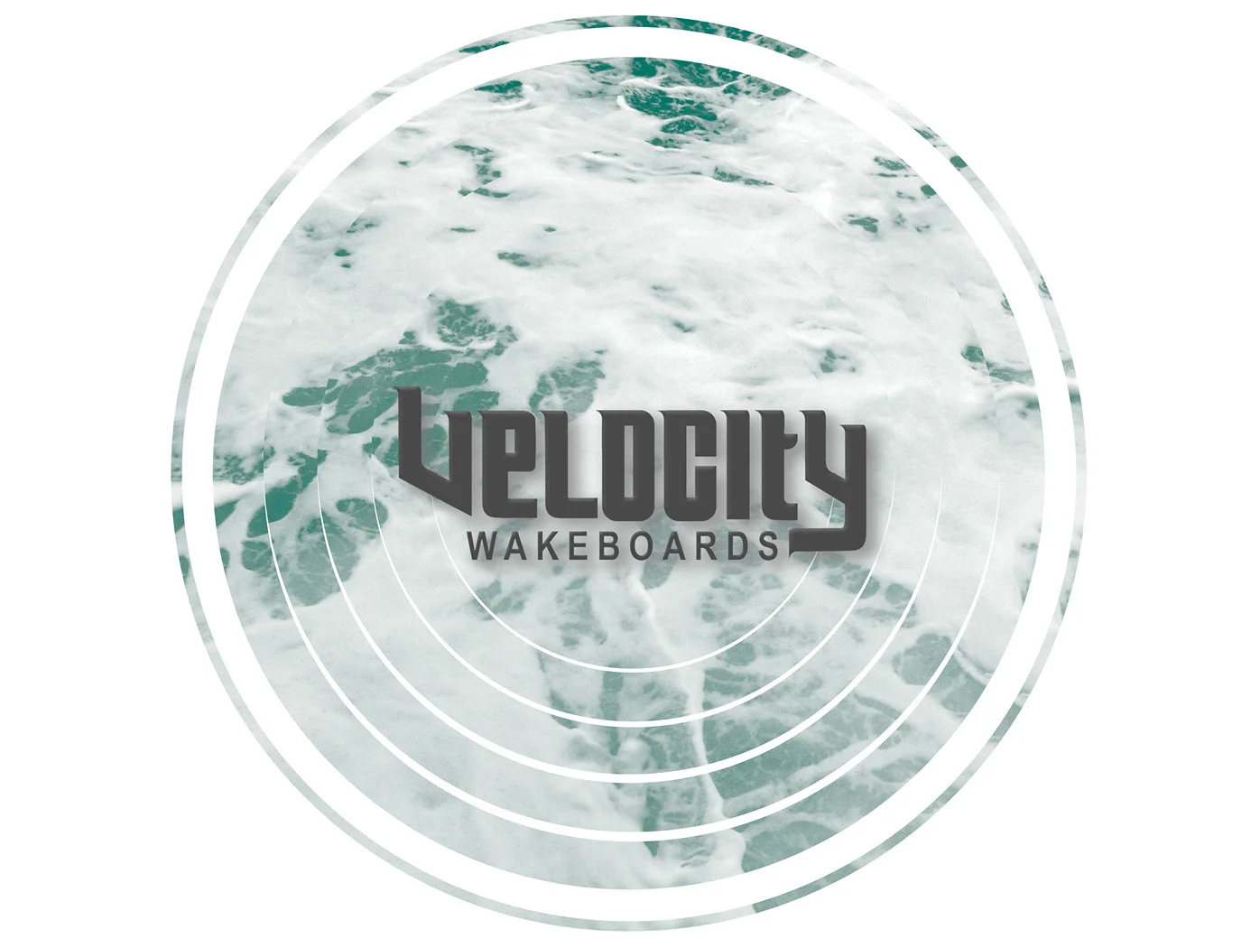
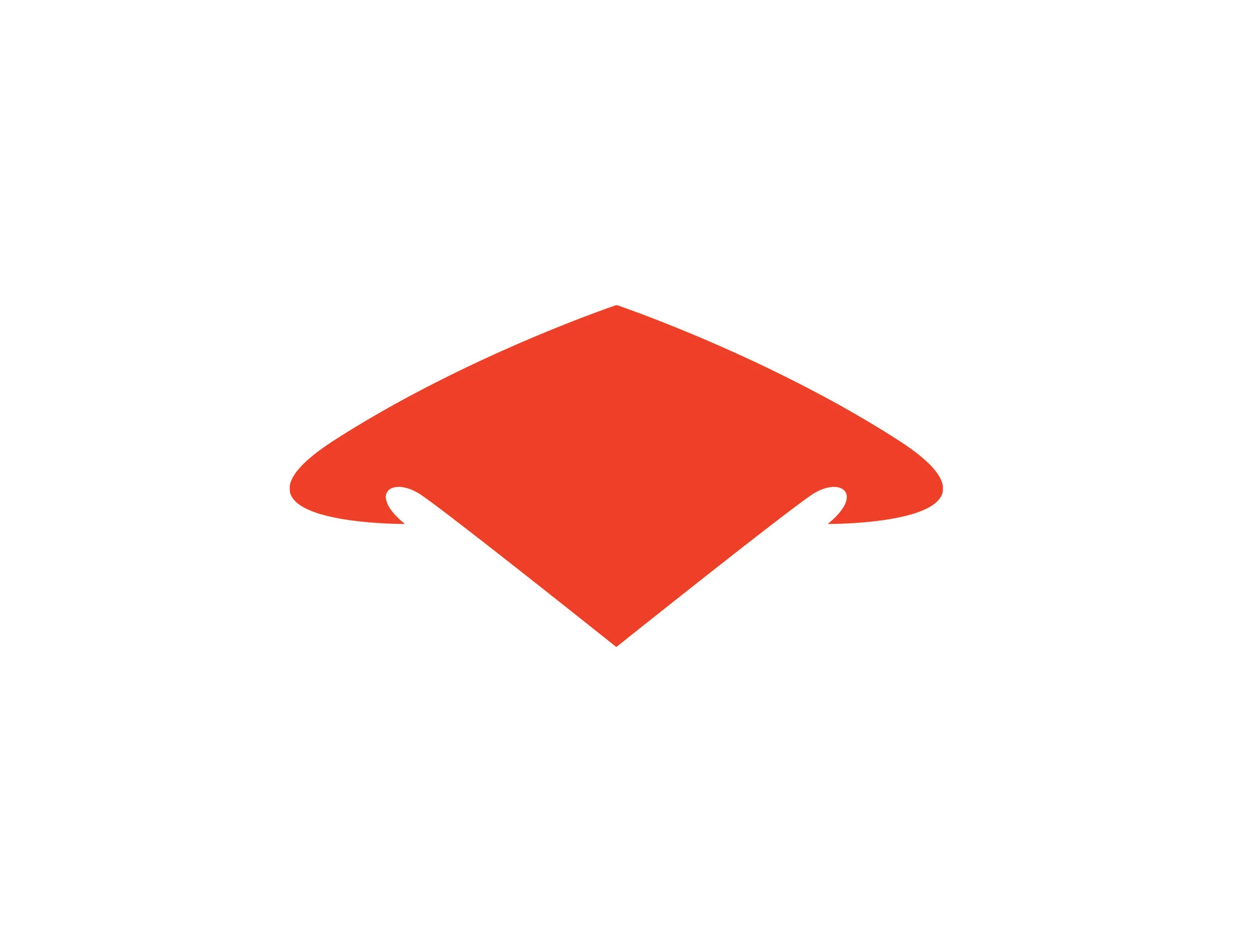
Given only the name of company, Velocity, I created the symbol and logo, along with the design for the initial website. The logo is bold, which could be easy to read on the bottom of a wakeboard. The symbol I created blends the water with the name, creating a V shape, and flaring out like a curling wave.
For the website, I wanted to convey the aesthetic of wakeboarding without direct references. The curved background in the website design, for example, gives the same pattern of the wake as a wakeboarder carves through the water in a more abstract way than a simple picture of the wake.